


The following questions and answers have been reviewed and verified by Riaan Engelbrecht, Lead BI Analyst at EPAM Anywhere. Thanks a lot, Riaan!
As the demand for data-driven decision-making continues to grow, Power BI has emerged as a leading business intelligence tool that helps organizations to visualize, analyze, and share insights from their data. Consequently, the need for skilled Power BI developers has increased significantly.
If you're preparing to interview for a Power BI developer job, it's essential to familiarize yourself with the most common Power BI interview questions for experienced professionals covering various aspects of this powerful tool. In this article, we've compiled a list of Power BI developer interview questions that will assist you in showcasing your expertise and standing out from the competition.
tired of job hunting?
Scroll no more. Send us your CV and we'll match it with our best remote Power BI developer jobs for you.
1. What is Power BI, and why is it important for businesses?
Power BI is a suite of business analytics tools developed by Microsoft that enables organizations to visualize and share insights from their data. It is important for businesses because it helps them make informed decisions based on data-driven insights, improving overall efficiency and competitiveness.
2. Can you explain the main components of Power BI?
The main components of Power BI are:
- Power Query: A data transformation and data mashup engine.
- Power Pivot: A data modeling and calculation engine.
- Power View: A data visualization tool.
- Power Map: A 3D geospatial data visualization tool.
- Power BI Service: A cloud-based platform for sharing and collaborating on reports and dashboards.
- Tabular Editor: An advanced tool used with Analysis Services and Power BI for working with tabular models. It's particularly useful for enhancing and optimizing data models in Power BI or SQL Server Analysis Services (SSAS).
- Power BI Premium: A comprehensive, advanced cloud-based analytics service that offers dedicated cloud resources, enhanced performance, and additional features for large-scale data modeling and business intelligence.
3. What are the different types of data sources supported by Power BI?
Here is the list of data sources that Power BI supports:
- Relational databases (e.g., SQL Server, Oracle, MySQL)
- Cloud-based services (e.g., Azure SQL Database, Salesforce, Google Analytics)
- File-based sources (e.g., Excel, CSV, JSON, XML)
- Web-based sources (e.g., REST APIs, OData feeds)
- On-premises data sources (e.g., SharePoint, Hadoop)
4. Explain the difference between Power BI Desktop and Power BI Service
Power BI Desktop is a Windows-based application used for creating reports and data models, while Power BI Service is a cloud-based platform for sharing, collaborating, and publishing reports and dashboards. Power BI Desktop is primarily used by developers and web analysts, while end-users use Power BI Service to consume and interact with the reports.
5. What is DAX, and how is it used in Power BI?
DAX (Data Analysis Expressions) is a formula language utilized in Power BI for creating calculated columns, measures, and custom tables. It is similar to Excel formulas but specifically designed to work with data models and perform advanced calculations on large datasets.
6. Can you explain the difference between a calculated column and a measure in Power BI?
A calculated column is a new column added to a table in the data model, with values calculated using a DAX expression. The calculated values are stored in the data model and available for visualization. On the other hand, a measure is a dynamic calculation performed at the time of the query, based on the current context of the report or visualization. Measures are not stored in the data model but are calculated on the fly.
7. What is the role of the Data Gateway in Power BI?
The Data Gateway is a service that helps you transfer secure data between on-premises data sources and Power BI Service. It acts as a bridge between the two, allowing Power BI to access and refresh data from on-premises sources without exposing the data source directly to the internet.
8. What are the different types of filters available in Power BI?
Power BI has three types of filters:
- Visual-level filters: Applied to individual visualizations on a report page.
- Page-level filters: Applied to all visualizations on a specific report page.
- Report-level filters: Applied to all visualizations across the entire report.
9. Can you explain the concept of data shaping in Power BI?
Data shaping is transforming and restructuring data to make it suitable for analysis and reporting. In Power BI, data shaping can be performed using Power Query, which provides a wide range of transformation functions, such as filtering, sorting, merging, appending, pivoting, and aggregating data.
10. What is the difference between a slicer and a filter in Power BI?
A slicer is a visual element in Power BI that allows users to filter data in a report by selecting specific values or ranges. Slicers provide a more interactive and user-friendly way to filter data than traditional filters. On the other hand, filters are applied directly to the data model or individual visualizations and are not visible to the end-user.
11. How can you optimize the performance of a Power BI report?
Some techniques for optimizing Power BI report performance include:
- Using appropriate data types and reducing the number of columns in the data model.
- Creating efficient DAX calculations and avoiding complex measures.
- Using aggregations and summary tables to reduce the amount of data processed.
- Applying filters and slicers to limit the data displayed in visualizations.
- Using incremental refresh to update only the changed data.
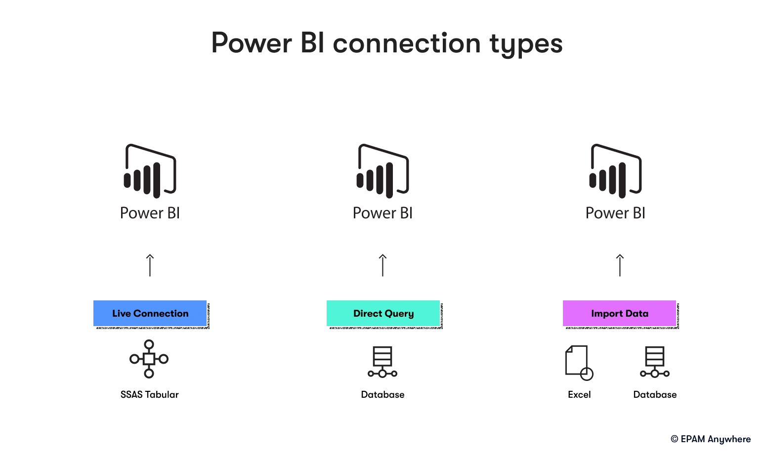
12. What is the difference between DirectQuery and Import mode in Power BI?
In Import mode, data is imported into the Power BI data model and stored in memory, allowing for fast query performance and data manipulation. DirectQuery mode, on the other hand, does not store data in the data model but instead sends queries directly to the data source. This mode is helpful in working with large datasets or real-time data but may have slower query performance than Import mode.

13. What are the different types of relationships in Power BI?
There are three types of relationships in Power BI:
- One-to-one: A single record in one table corresponds to a single record in another table.
- One-to-many: A single record in one table corresponds to multiple records in another table.
- Many-to-many: Multiple records in one table correspond to multiple records in another table.
14. What is the difference between a clustered and a non-clustered column chart in Power BI?
A clustered column chart displays data separately for each category, with columns grouped by the category axis. A non-clustered column chart, or a stacked column chart, displays data in a single column for each category, with segments stacked on top of each other to represent different data series.
15. How can you create a custom visual in Power BI?
Custom visuals can be created using the Power BI Custom Visual SDK, which is based on JavaScript and D3.js. Developers can create custom visuals that extend the built-in visualization capabilities of Power BI and can be imported into reports and dashboards.
16. What is the role of R and Python in Power BI?
R and Python can be used in Power BI for advanced data manipulation, statistical analysis, and machine learning. Power BI supports R and Python scripts in Power Query for data transformation and in the data model for creating custom columns and tables. Additionally, R and Python visuals can be added to Power BI reports for creating custom visualizations and analytical models.
17. What is the difference between a matrix and a table visualization in Power BI?
A matrix visualization displays data in a tabular format with hierarchical row and column headers, allowing data to be grouped and summarized across multiple levels. A table visualization, on the other hand, displays data in a simple tabular format without any hierarchy or summarization.

19. What is the difference between a dashboard and a report in Power BI?
A dashboard is a single-page collection of visualizations and key metrics designed to provide a high-level overview of the data. Dashboards are created in Power BI Service and can include visualizations from multiple reports.
On the other hand, a report is a multi-page document containing visualizations, tables, and other elements that provide detailed analysis and insights into the data. Reports are created in Power BI Desktop and can be published to Power BI Service.
20. What is the role of themes in Power BI?
Themes in Power BI apply a consistent color scheme, font, and formatting to reports and dashboards. Themes can be applied at the report or Power BI Service levels, allowing organizations to create a consistent look and feel across all their reports and dashboards.
21. What is the difference between a KPI and a card visualization in Power BI?
A KPI (Key Performance Indicator) visualization displays a single metric, a target value, and an indicator that shows the performance relative to the target. A card visualization, on the other hand, displays a single metric without any target or performance indicator.
22. How can you schedule data refresh in Power BI?
Data refresh in Power BI can be scheduled using the Power BI Service. In the dataset settings, you can configure the refresh frequency (daily, weekly, etc.), the time of day, and the timezone. You can also set up email notifications for refresh failures or use the Power BI API to monitor the refresh status programmatically.
23. What is the difference between a waterfall and funnel charts in Power BI?
A waterfall chart displays the cumulative effect of sequential positive and negative values, typically used to visualize financial data or the contribution of different factors to a total. A funnel chart, on the other hand, displays the progression of data through a series of stages or steps, typically used to visualize sales pipelines or conversion rates.
24. What is the role of bookmarks in Power BI?
Bookmarks in Power BI are used to capture the current state of a report, including filters, slicers, and the visibility of visualizations. Bookmarks can be used to create interactive reports with navigation buttons, allowing users to switch between different views or scenarios without modifying the underlying data model.
25. Can you explain the concept of row-level security in Power BI?
Row-level security (RLS) is a feature in Power BI that allows you to restrict data access for specific users based on their roles or attributes. RLS is implemented by defining DAX expressions that filter the data model based on the user's context, ensuring that users can only see the data they are authorized to access.
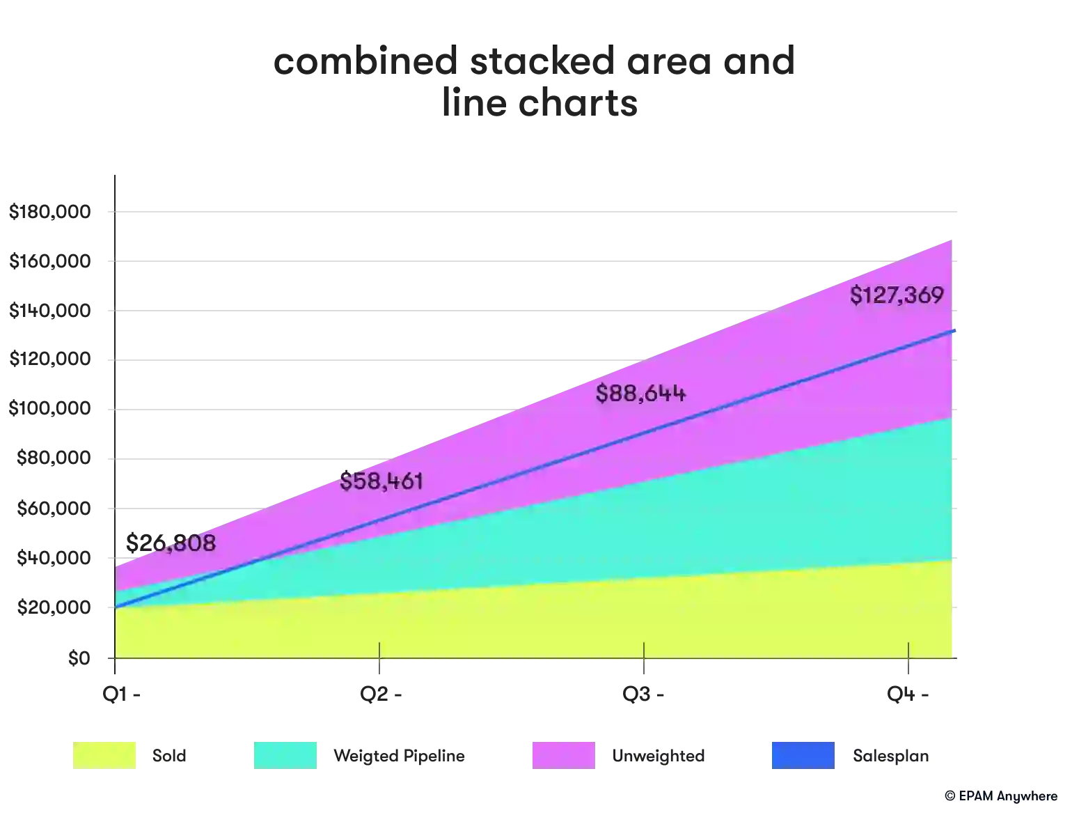
26. What is the difference between a line chart and an area chart in Power BI?
A line chart displays data as points connected by straight lines, typically used to visualize trends or changes.
An area chart is similar to a line chart but fills the area between the line and the axis with color, emphasizing the magnitude of the changes. Both charts represent continuous data over a period, but area charts provide a stronger visual representation of the volume or quantity associated with the changes.
27. How can you create a drill-through report in Power BI?
A drill-through report is created by adding a drill-through filter to a report page, which allows users to navigate from a summary visualization to a detailed view of the data. To create a drill-through report, follow these steps:
- Create a new report page for the drill-through details.
- Add a drill-through filter to the page and configure the field that will be used for navigation.
- Add visualizations to the drill-through page that display the detailed data.
- On the summary page, add an action to the visualization that triggers the drill-through navigation.

28. What is the difference between a bar chart and a column chart in Power BI?
A bar chart displays data as horizontal bars, with the length of the bars representing the values. A column chart, on the other hand, displays data as vertical bars, with the height of the bars representing the values. Both charts can be used to compare data across categories, but bar charts are generally more effective for displaying data with long category labels or a large number of categories.
Power BI interview questions for experienced professionals
29. What is the role of Q&A in Power BI?
Q&A is a natural language query feature in Power BI that allows users to ask questions related to their data and receive answers with visualizations or tables. Q&A uses machine learning and natural language processing to understand the user's intent and generate the appropriate query and visualization based on the data model.
30. Can you explain the concept of data lineage in Power BI?
Data lineage is the process of tracking the flow of data from its source to its destination, including all the transformations and relationships along the way. In Power BI, data lineage can be visualized using the lineage view in Power BI Service, which shows the dependencies between datasets, reports, and dashboards. Data lineage is important for understanding the impact of changes to the data model, ensuring data quality, and troubleshooting issues.
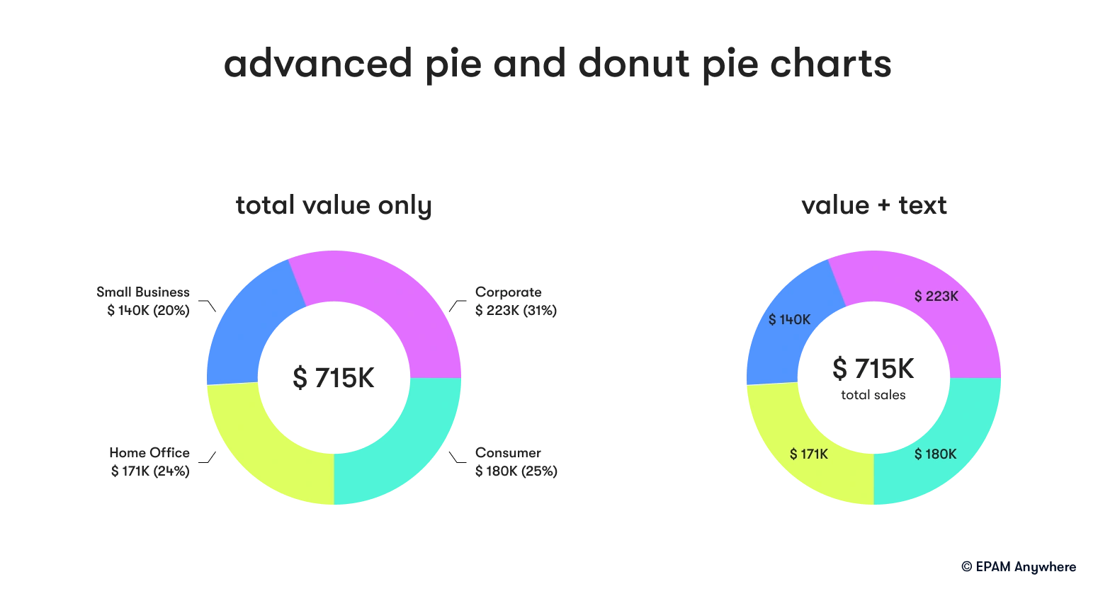
31. What is the difference between a pie chart and a donut chart in Power BI?
A pie chart displays data as segments of a circle, with the size of the segments representing the values. A donut chart is similar to a pie chart but has a hole in the center, creating a ring-like appearance. Both charts show the proportion of each category within a total. Still, donut charts can also display additional information in the center hole, such as a total value or a label.

32. How can you create a hierarchy in Power BI?
Hierarchies in Power BI can be created by organizing related fields into a parent-child structure, allowing users to drill down or up through the levels of the hierarchy. To create a hierarchy, follow these steps:
- In the data model, select the table containing the hierarchy fields.
- Drag the parent field onto the child field to create a hierarchy.
- Add additional fields to the hierarchy as needed by dragging them onto it.
33. What is the role of the Power BI API?
The Power BI API is a RESTful web service that allows developers to programmatically interact with Power BI resources. The API can perform tasks such as creating and updating datasets, refreshing data, managing dashboards and reports, and embedding Power BI content in web applications.
34. What is the difference between a scatter chart and a bubble chart in Power BI?
A scatter chart in Power BI displays data as a collection of points with their positions in the chart determined by the values of two variables. It's typically used to visualize the correlation between two numerical variables.
On the other hand, a bubble chart is an extension of a scatter chart that adds a third variable, represented by the size of the points (bubbles). This third variable allows a bubble chart to represent an additional dimension of data, providing more context and making it easier to understand complex relationships between variables.
35. Can you explain the concept of conditional formatting in Power BI?
Conditional formatting is a feature that allows you to apply different formatting styles to data elements based on their values or other conditions. Conditional formatting can be applied to various visual elements, such as table cells, matrix cells, data bars, and color scales. Some common use cases for conditional formatting include highlighting outliers, emphasizing trends, and visualizing data quality issues.


36. What is the role of Power BI templates, and how can they be used?
Power BI templates are pre-built report structures that include data model schema, visualizations, and formatting but without the actual data. They can standardize report designs across an organization, streamline the report creation process, and ensure consistency in branding and layout. To create a Power BI template, you can save an existing report as a template file (.pbit) and then use it as a starting point for new reports by importing the template and connecting it to the appropriate data source.
37. Can you explain the concept of data profiling in Power BI?
Data profiling is examining and analyzing data to understand its structure, quality, and distribution. In Power BI, data profiling can be performed using Power Query, which provides various data profiling features such as column statistics, data type detection, and error highlighting. Data profiling is essential for identifying data quality issues, inconsistencies, and outliers, which can impact the accuracy and reliability of the analysis and reporting.
38. What is the difference between static and dynamic segmentation in Power BI?
Static segmentation divides data into predefined segments or groups based on fixed criteria, such as age ranges or revenue tiers. In Power BI, static segmentation can be achieved by creating calculated columns or measures that assign each data point to a specific segment based on predefined criteria.
Dynamic segmentation, however, allows users to interactively define the segments or groups based on their specific needs or analysis requirements. In Power BI, dynamic segmentation can be implemented using slicers, filters, or DAX expressions that respond to user input and dynamically update the segments based on the selected criteria.


With a focus on remote lifestyle and career development, Gayane shares practical insight and career advice that informs and empowers tech talent to thrive in the world of remote work.
With a focus on remote lifestyle and career development, Gayane shares practical insight and career advice that informs and empowers tech talent to thrive in the world of remote work.
Explore our Editorial Policy to learn more about our standards for content creation.
read more


